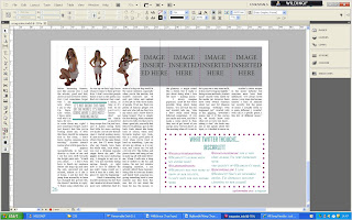
Last lesson I worked on the double page spread of my magazine, and decided to create a box of text separate from the actual article, which is still related to the topic of the artist and links in with the article. This helps to break the double page spread up so that it isn't all just a big chunk of text, and looks less daunting to the reader. Inside the box I included comments from twitter users that are fans of the featured artist, Scarlett's music, to make my target audience feel they can contribute to the magazine, too. Twitter is commonly used across my target audience and so I feel that this box will be appreciated by my target audience. The box keeps to the house style, and rather than being just a plain line I changed it to polka dots to make it more attractive to the reader's eye, and this also adds the glamorous celebrity effect as it almost mimics a celebrity's dressing room, with a mirror surrounded by circular lights.


No comments:
Post a Comment